
The Biggest Lie In Modern Investing
Why “Markets Always Go Up” Is Not the Truth Most Investors Think It Is
By Adrian C. Spitters, CFP® and Peter J. Merrick, TEP®
This analysis is part of an ongoing series of long-form investigations published in The Merrick Spitters Reset Report™ that examine long-term developments affecting property rights, governance systems, and financial architecture.
This article presents an opinion-based analysis of how long-term market performance is commonly framed and interpreted. It is intended to contribute to a broader discussion and should not be interpreted as individualized investment advice. The charts referenced are used for illustrative and comparative purposes only.
Some investors believe markets are resilient and always recover. Others are beginning to question whether what appears stable is actually the result of structural changes that are not being fully explained.
For many, that question does not begin with theory. It begins with a simple concern: is the system protecting their wealth, or simply asking them to trust it?
The Comforting Story That Is Being Sold
Investors are repeatedly shown a simple and emotionally reassuring message that appears especially during times of geopolitical stress or market volatility. The language is familiar and consistent. There have always been wars, there have always been recessions, and there have always been crises, yet despite all of it, the market keeps moving higher over time. The conclusion that follows is rarely stated as a suggestion. It is delivered as a principle. Stay invested, do not worry, and everything recovers.
This message is often reinforced using a widely circulated chart that aligns major global events with a steadily rising equity market. The chart appears to demonstrate that no matter what happens in the world, markets ultimately continue upward. In most cases, this chart is presented with standard disclaimers indicating that it is for illustrative purposes and that past performance does not guarantee future results. However, the psychological message it delivers goes far beyond those disclaimers. It conditions investors to believe that volatility is temporary, that the system is stable, and that participation alone is sufficient for long-term success.
It is persuasive because it simplifies complexity. It is powerful because it removes doubt. And it is incomplete because it omits the most important part of the story.
What is being presented as a story about markets is, in reality, a story about system design.
What you are about to see is not false, but it is incomplete in ways that materially change how most investors interpret it.
This article builds on two earlier analyses that form the structural foundation for what follows.
The first, titled The Architecture of Financial Power, examines how financial systems have evolved over centuries through distinct monetary regimes, each redefining how money, credit, and markets function beneath the surface, and showing that what appears to be a continuous system is, in reality, a sequence of engineered transitions that redistribute control over time.
The second, titled When Stability Feels Tighter Than It Should, examines how those structural changes are now being experienced in real time by business owners, landowners, and investors, where access to capital is tightening, flexibility is diminishing, and the assumptions that once supported long-term planning are no longer holding in the same way. It demonstrates that even when markets appear stable, the conditions required to access capital, maintain flexibility, and execute decisions are becoming more constrained.
This article extends that framework. It translates those structural observations into a direct examination of one of the most widely accepted beliefs in modern investing: that markets always recover, and that time alone resolves risk.

Source: Commonly circulated industry chart used for illustrative purposes to show historical market performance alongside major global events. This chart is not predictive and does not represent any specific investment recommendation.
What That Chart Does Not Tell You
The chart creates the impression that one continuous financial system has existed for decades, operating under a consistent set of rules and simply absorbing external shocks along the way. That is not what happened. The system itself changed, and it changed multiple times in ways that fundamentally altered how markets function.
What appears to be one smooth upward trajectory is actually the result of several different monetary regimes layered on top of one another.
Each of those regimes had its own structure, its own rules, and its own mechanisms for creating stability. This is not theoretical.
Earlier analysis of long-term financial architecture shows that markets have not operated within a single continuous system. They have moved through distinct monetary regimes, each governed by different rules for credit creation, liquidity, and intervention.
And those structural changes are no longer confined to history. They are now being experienced directly by investors and operators, where financing conditions are tightening, flexibility is diminishing, and assumptions that once held are no longer reliable.
The chart does not show that. It cannot show that.
When those regimes are compressed into a single visual line, something critical disappears. The rules of the game are removed from the picture, and what remains is a simplified narrative that suggests permanence where there has only ever been adaptation.
To address this, a second chart has been introduced below. This chart is not a replacement for historical market data, nor is it intended as a predictive tool. It is a conceptual illustration of monetary regime shifts, designed to highlight the structural changes that are not visible in traditional performance charts. It is presented strictly for interpretive purposes so that investors can evaluate the original chart within a broader and more accurate context.
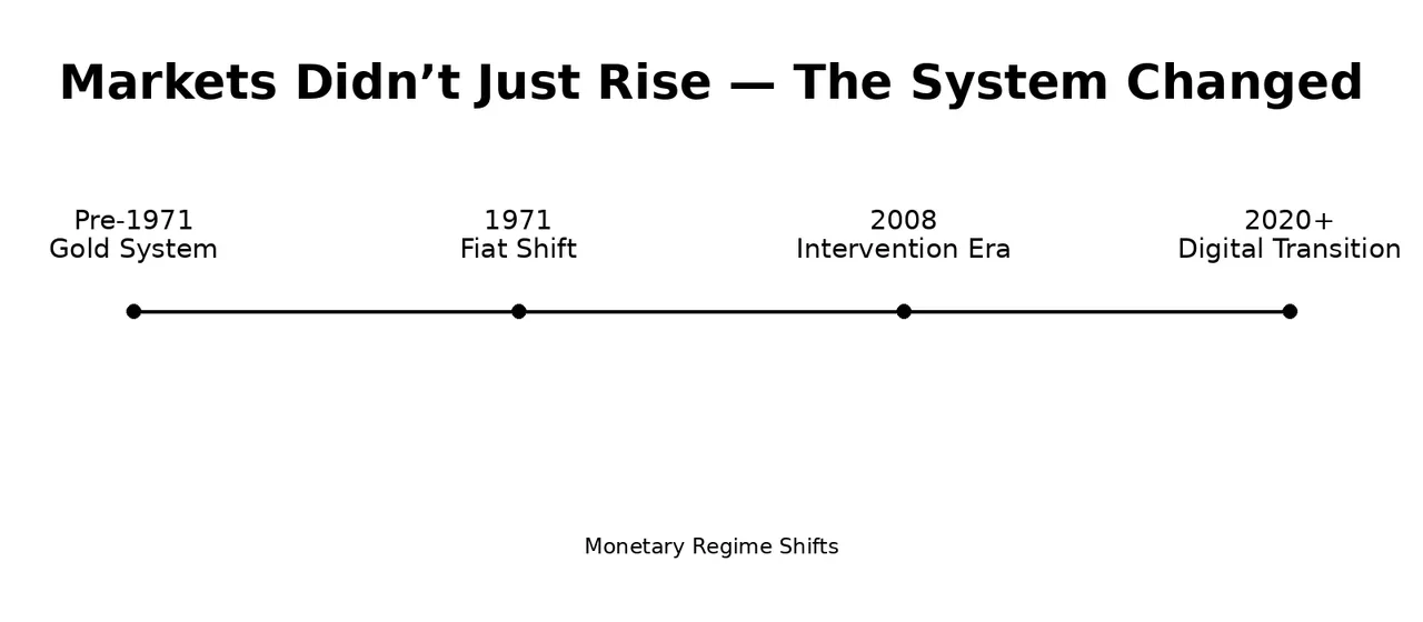
Source: Author-created conceptual illustration highlighting major monetary regime transitions. This chart is for educational and interpretive purposes only and does not represent market performance or investment advice.
The first chart shows what happened to prices. This chart shows what happened to the system. And those are not the same story.
The original chart measures outcomes. The corrected chart explains conditions. The chart you were shown assumes the system remained stable. History shows it never has.
The First Distortion: The System Was Reset in 1971
The original chart suggests continuity across the twentieth century, yet one of the most significant structural breaks in financial history occurred in 1971. Before that point, money was tied to gold through the Bretton Woods system. This linkage imposed discipline on governments and central banks by limiting how much currency could be created. There were constraints on debt expansion, and there was a tangible anchor supporting the value of money.
In 1971, that system ended. The U.S. dollar was no longer convertible into gold, and the world transitioned into a pure fiat system where money could be created through policy rather than backed by a physical asset. From that moment forward, the financial system began operating under a completely different set of rules. Credit could expand without hard limits, debt could grow faster than the economy, and financial markets became increasingly dependent on central bank policy.
The corrected chart highlights this moment as a structural reset, not just a historical event. When viewed through this lens, the steep acceleration in asset prices that appears in the original chart after the early 1970s is not simply evidence of resilience. It is consistent with a new system operating under fundamentally different conditions. The original chart does not explain this shift, and without that explanation, the conclusions drawn from it are incomplete.
Investors were not simply moved forward through time. They were moved into a different system without being told the rules had changed.
The Second Distortion: The Market Is Not the Same Market
The original market chart gives the impression that investors are observing the performance of a stable and continuous group of companies over time. That assumption is not accurate, and it introduces one of the most overlooked distortions in how long-term market performance is presented.
This distortion relates specifically to how market indices are constructed and maintained. It is separate from the structural changes in the monetary system itself, which are illustrated in the corrected chart. Together, these distortions show that both the system and the market inside it have been continuously evolving, even when the visual narrative suggests stability.
Market indices are constantly changing. Companies that fail are removed, and companies that succeed are added. This process creates a survivorship-biased system that naturally trends upward because underperforming components are continuously replaced.
This dynamic is rarely explained when the chart is presented, yet it plays a significant role in shaping the visual outcome. The index is not a static representation of the economy. It is a curated and evolving collection designed to reflect strength. As weaker participants disappear, the remaining structure becomes stronger by definition, and the chart continues to rise.
The corrected chart does not replicate index behaviour. It isolates and highlights the structural changes behind the system itself. By doing so, it highlights that the upward movement seen in the original chart is not purely the result of consistent performance. It is also the result of continuous adaptation and replacement within the system.
The Third Distortion: Intervention Became the System
The global financial crisis of 2008 is presented in the original chart as another temporary disruption that markets eventually overcame. What is not fully addressed is how that recovery occurred. The system did not simply stabilize on its own. It required unprecedented levels of intervention.
Central banks introduced large-scale asset purchase programs, injected liquidity into financial markets, and maintained historically low interest rates for extended periods. These actions were not minor adjustments. They represented a fundamental shift in how markets are supported. From that point forward, financial markets became closely tied to policy decisions, and the line between market-driven outcomes and policy-driven outcomes became increasingly blurred.
The corrected chart identifies this period as the beginning of a central bank liquidity regime, a system where financial markets are increasingly supported and stabilized by central bank policy. This is not a label designed to provoke concern. It is a structural observation. Markets are no longer functioning solely as independent mechanisms of price discovery. They are functioning within a system where stability is increasingly engineered, not emergent. The original chart does not make this distinction, and without it, the narrative of natural resilience becomes misleading.
What is presented as recovery is often the result of intervention. What is presented as stability is often the result of support.
The Fourth Distortion: The Illusion of Resilience
The original chart suggests that markets recover naturally from crises and continue rising over time. However, each recovery has required increasingly aggressive intervention. The inflation crisis of the early 1980s was addressed through interest rate adjustments. The early 2000s required monetary easing. The 2008 crisis required system-wide rescue measures. The 2020 disruption required a global liquidity response of unprecedented scale.
This pattern raises an important question that is not addressed in the original chart. If each cycle requires more support than the last, can the system still be described as self-sustaining? The appearance of resilience may in fact be the result of continuous reinforcement rather than inherent stability.
The corrected chart does not attempt to answer this question definitively, but it does highlight the progression. It shows that what appears to be a stable upward trend is supported by a series of interventions that have grown in scale over time. This does not invalidate the original chart, but it changes how it should be interpreted.
Why This Matters to You
This discussion is not theoretical. It directly affects individuals and families who rely on financial markets for long-term security. Retirees depend on portfolio stability for income that cannot easily be replaced. Business owners depend on asset values to support succession, financing, and exit planning. Families managing generational wealth often assume that long-term participation in markets provides sufficient protection because that is what they have been told.
That assumption is where the risk begins. Because if the system changes again, portfolios that depend entirely on that system do not just fluctuate.
They stop behaving in ways you recognize. Income becomes uncertain. Liquidity becomes conditional. Decisions that once felt simple become constrained. And by the time that shift becomes visible to most, it is already too late to adapt effectively.
Many investors have been told their money is safe because markets recover. Very few have been told that the system supporting those recoveries has been repeatedly redesigned. The rules governing money, credit, and intervention today are not the same as they were even one or two generations ago.
For many investors, confidence is not grounded in structural understanding. It is grounded in repetition. A message heard often enough becomes accepted as truth, even when the underlying conditions have changed. Recognizing this does not require abandoning markets. It requires understanding that participation alone is not the same as protection, and that the structure behind the market matters just as much as the market itself.
The Emerging Shift No One Is Explaining Clearly
The financial system is now entering another phase of development, and this time the changes are being introduced as technological progress rather than structural transition. What is changing is not just the speed of money. It is the structure around how money is accessed, used, and controlled.
For the first time, the infrastructure itself is becoming part of the financial system in a way that can influence participation, not just facilitate it.
This does not require a crisis. It can occur gradually, through adoption, convenience, and normalization, as new systems become easier to use and are adopted without resistance.
What is not being explained with the same clarity is what comes with that integration. As financial infrastructure becomes more centralized and more digitized, control over access, settlement, and participation becomes more tightly linked to the system itself. The question is no longer just how money moves.
It becomes who controls the conditions under which it can move, and whether those conditions can change without the participant fully recognizing when they did.
This is not presented as a conclusion, but as a structural reality that is already beginning to take shape. Most investors will not recognize it as it happens. Because it does not arrive as a single event. It arrives as a series of small changes that feel normal, until the system they are operating in is no longer the one they thought they understood.
Every previous monetary transition changed how money functioned within the system. This phase has the potential to change how individuals interact with the system itself. The corrected chart includes this emerging phase not as a prediction, but as a continuation of the same pattern that has repeated throughout monetary history. The system is changing again. The difference now is that the change is being introduced quietly, through infrastructure rather than crisis.
The Real Issue: Dependency
Modern investors are deeply integrated into the financial system in ways that are often not fully recognized. Retirement savings, investment portfolios, income streams, and even access to liquidity are all tied to the stability of markets and the policies that support them. This level of integration does not just create participation. It creates dependency.
When everything is inside the system, everything becomes subject to the system. And when outcomes depend on the system, control over the system becomes the defining variable. If the rules change, access changes. If policy shifts, outcomes shift. If the structure evolves, the behaviour of assets inside that structure evolves with it, whether investors are aware of it or not.
This is not presented as a warning. It is a structural observation. The more centralized and interconnected a system becomes, the more influence that system has over the outcomes of those operating within it. The original chart does not show this relationship. It presents stability without showing what that stability depends on. The corrected chart brings that dependency into focus by showing that the system itself has been continuously reshaped in order to maintain that stability.
The more dependent a portfolio is on that system, the more exposed it becomes to changes made within it.
Owning Assets in Order of Asset Security™
History shows that not all assets behave the same when the system around them changes. Some assets exist entirely within the financial system and are directly influenced by policy decisions, liquidity conditions, and the stability of financial markets. Their value is shaped by the system that supports them.
Other assets are tied more directly to the real economy. They derive their value from production, utility, and physical demand rather than from the structure of financial markets alone. Their relationship to the system is different because their value does not depend solely on how that system is managed.
The framework known as Owning Assets in Order of Asset Security™ provides a way to examine these differences through a structural lens. It is not a recommendation or a prediction. It is a way of understanding how different forms of wealth respond when the rules governing money, credit, and financial markets change.
When viewed alongside both charts, this distinction becomes more visible. The original chart reflects assets that have performed within the system. The corrected chart highlights how that system has evolved. Together, they reinforce a simple but often overlooked reality. Not all wealth is equally exposed to systemic change, and not all assets respond the same way when the structure supporting them shifts.
A More Honest Interpretation of History
Markets did not simply rise through chaos. They rose through structural redesign, policy intervention, and repeated monetary transformation. Each time the system was placed under stress, it was adjusted in ways that allowed it to continue functioning. Those adjustments were not minor. They were foundational, and they changed how the system operates each time they were introduced.
What is often presented as resilience is, in many cases, the result of those adjustments. Stability did not emerge on its own. It was constructed, reinforced, and maintained through changes that are not visible in simplified market narratives. Which means the stability investors rely on is not a permanent feature of the system. It is a condition that has to be continuously maintained.
When both charts are viewed together, the difference becomes clear. The original chart shows the outcome that investors are shown. The corrected chart shows the structure that made that outcome possible. Neither chart is incorrect, but one is incomplete without the other. Without understanding the structure, the outcome can be easily misinterpreted as something it is not.
What You Were Shown vs What You Were Not Told
The first chart tells a story that is easy to believe. It shows markets enduring wars, recessions, political upheaval, and financial crises, yet continuing to rise over time. It presents a version of history where patience is always rewarded and where the system appears stable, durable, and self-correcting. That message has been repeated so consistently that it has become a default belief for many investors.
What that chart does not show is what made those outcomes possible. It does not show that the rules governing money changed in 1971. It does not show that markets became increasingly dependent on credit expansion rather than production alone. It does not show that after 2008, intervention did not simply support the system but became part of the system itself. And it does not show that today, another layer of structural change is being introduced through digitized financial infrastructure.
The second chart does not contradict the first. It explains it. What appears to be a single uninterrupted rise is actually a sequence of different systems, each redesigned to keep the structure functioning under new pressures. The first chart shows what happened to asset prices. The second chart shows what happened to the system that made those outcomes possible.
For many investors, this distinction changes the conversation entirely. The question is no longer simply whether markets will go up. The question becomes how the system supporting those markets is evolving and what that means for long-term security. Stability may not be inherent. It may be constructed. Resilience may not be automatic. It may be managed. Continuity may not mean the absence of change. It may be the result of repeated structural adjustments.
This is not a call to exit markets. It is a call to see them more clearly. Once the structure becomes visible, the assumptions begin to change. This perspective reflects a broader structural pattern that has repeated across financial history.
Long-term analysis of monetary systems shows that markets do not simply rise through time. They are rebuilt, restructured, and redefined through successive regimes, each altering how money, credit, and stability function beneath the surface.
And the tightening conditions now being experienced across business, credit, and investment environments suggest that another phase of that transition may already be underway.
The chart suggests permanence. The structure suggests change.
Investors begin to ask where their assets sit within the system, how dependent those assets are on policy and liquidity, and how those assets may behave if the framework shifts again.
This is where the concept of Owning Assets in Order of Asset Security™ becomes relevant. Not as a prediction, but as a way of evaluating how wealth behaves across changing systems rather than assuming that one system will persist indefinitely.
The most important takeaway is not that the system is failing. It is that the system is changing, and the assumptions investors rely on may not be changing with it. Investors who recognize this are not reacting to headlines. They are paying attention to structure, because structure is what ultimately determines outcomes.
And once structure becomes the focus, the question changes.
It is no longer simply about what assets you own. It becomes about where those assets sit within the system, and how exposed they are to the next change in that system.
What This Transition Is, And What It Is Not
There is a growing segment of investors, commentators, and analysts who are increasingly concerned about what they interpret as a potential breakdown of the financial system. These perspectives are often dismissed as extreme or overly pessimistic, yet they are rooted in a recognition that the structure of the system is changing in ways that are not being clearly explained to the broader public. What is often missing from that conversation is a more precise interpretation of what those changes actually represent within the context of financial history.
The more accurate lens is not necessarily one of collapse in the way most people imagine. Financial history does not show repeated total collapse of markets or systems. It shows repeated periods of reset, where the underlying structure of money, credit, and control is redesigned in response to accumulated pressures. In each of those moments, the system itself did not disappear. It adapted. What changed was not the existence of markets, but the rules that determined how those markets functioned and which assets benefited within that structure.
This distinction is critical because it reframes the nature of risk. The primary risk is not simply that markets decline. Markets have always experienced declines and recoveries. The deeper risk is that the assets held within a portfolio may not behave the same way, may not retain the same role, or may not be supported in the same way within the next version of the system. Investors who are focused only on price movement may overlook the structural changes that determine how those prices are formed in the first place.
For many investors, confusion arises because structural transitions are being interpreted through the lens of traditional market cycles. The expectation becomes one of a sudden crash or collapse, when what may actually be occurring is a gradual transition into a different system operating under different rules. This is where the corrected chart becomes relevant, not as a predictive tool, but as a structural illustration showing that each major phase of financial history has involved a shift in how money, credit, and control operate within the system. The emerging phase, including the digitization of financial infrastructure and the development of digital currency frameworks, reflects another stage in that same pattern.
From this perspective, the central question changes. It is no longer a question of whether markets will survive, because markets have consistently persisted through every previous transition. The more relevant question is whether the assets held today are positioned to survive and function effectively within the next version of the system. Historical patterns suggest that not all assets transition equally. Some are revalued, some are constrained, some are restructured, and some lose their relevance as the system evolves around them.
This is where the concept of Owning Assets in Order of Asset Security™ becomes a practical framework rather than a theoretical idea. It provides a way to evaluate how different forms of wealth may respond under changing system conditions, rather than assuming that all assets will benefit equally from continued participation. The objective is not to predict collapse, nor to abandon markets, but to recognize transition and understand how structural change influences outcomes over time.
Positioning, in this context, becomes a matter of awareness rather than reaction. It requires recognizing the direction of structural change before it becomes obvious and considering how assets are exposed to those changes. Because, as financial history has demonstrated repeatedly, by the time a transition becomes widely visible to most participants, the ability to adapt in a meaningful way has already begun to narrow.
Final Thoughts
Markets may continue to rise. That has been the consistent message investors have been shown, reinforced through decades of charts, commentary, and repetition. The more important question is not whether markets rise, but whether they are rising under the same rules you believe you are investing in, or under a system that has already changed in ways that are not immediately visible.
Because if the system has changed, then the behaviour of assets inside that system changes with it. What once produced stability may no longer produce the same outcome. What once provided income may no longer provide reliability. And what once appeared diversified may, in reality, be concentrated within a single system whose rules are no longer static.
History does not show a system that remains constant. It shows a system that adapts, restructures, and resets under pressure. Each transition preserves the appearance of continuity while altering the underlying mechanics that determine how wealth is created, supported, and sustained.
Investors are not typically removed from the system during these transitions. They are carried through them, often without being told that the rules governing their assets have changed. This is not a new phenomenon. It is a recurring feature of how financial systems evolve.
Across policy circles and global financial forums, these transitions are increasingly framed as long-term system redesign and economic reconfiguration. Regardless of terminology, the underlying pattern is not new. Financial history shows that systems are periodically restructured, and those restructurings redefine how money, assets, and control operate within the economy.
This is where the distinction between participation and positioning becomes critical. Participation assumes the system will continue to behave as it has. Positioning recognizes that the system itself is the variable. It asks not just what assets are owned, but how those assets interact with the structure that supports them.
This is the foundation of Owning Assets in Order of Asset Security™. It is not based on predicting collapse. It is based on understanding transition. It recognizes that different assets respond differently when the system changes, and that preserving wealth across generations requires more than assuming continuity. It requires evaluating where that wealth sits within a system that has never remained the same.
Because the system has never stayed the same. And investors who assume it will are not investing; they are trusting.
These ideas are explored in greater depth in It Starts With Gold™, where the relationship between monetary history, asset ownership, and financial system evolution is examined through the lens of long-term wealth preservation. For ongoing analysis of structural changes in global finance, follow The Merrick Spitters Reset Report™, where these developments are discussed as part of a broader examination of long-term economic transformation.

About the Authors
Adrian C. Spitters is a veteran private wealth advisor with more than thirty-eight years of experience in risk management, long-term financial planning, and asset protection. Raised on a dairy farm in British Columbia’s Fraser Valley, he brings a grounded understanding of land stewardship and the economic pressures facing Canadian families. Adrian advises business owners, professionals, and farm families on practical strategies to safeguard their wealth from financial, legislative, and global-system risks. His work integrates strategic planning with real-world insight from decades in the financial sector. Read Adrian C. Spitters’ full biography here.
Peter J. Merrick is an international speaker and educator in the fields of succession, pension, and wealth preservation. He has spent more than three decades advising business owners, professionals, and family enterprises on how to structure, protect, and transition wealth across generations. His work blends technical expertise with clear, accessible guidance that helps Canadians prepare for economic and legislative uncertainty. Peter has authored multiple bestselling books and continues to contribute to national discussions about financial resilience and sovereignty. Read Peter J. Merrick’s full biography here.
References
- Eichengreen, Barry. Globalizing Capital: A History of the International Monetary System. 2nd ed. Princeton, NJ: Princeton University Press, 2008.
- Kindleberger, Charles P., and Robert Z. Aliber. Manias, Panics, and Crashes: A History of Financial Crises. 7th ed. London: Palgrave Macmillan, 2015.
- Reinhart, Carmen M., and Kenneth S. Rogoff. This Time Is Different: Eight Centuries of Financial Folly. Princeton, NJ: Princeton University Press, 2009.
- Reinhart, Carmen M., and M. Belen Sbrancia. “The Liquidation of Government Debt.” National Bureau of Economic Research Working Paper No. 16893, 2011.
- Bank for International Settlements. Annual Economic Report. Basel: BIS, various years.
- International Monetary Fund. Global Financial Stability Report. Washington, DC: IMF, various editions.
- Bank for International Settlements. Central Bank Digital Currencies: Foundations and Core Features. BIS Report No. 1, 2020.
- “An Index of Financial Stress for Canada.” Bank of Canada Working Paper No. 2003-14. Ottawa: Bank of Canada, 2003.